A visualization of a fact about probability
Note: I no longer understand why I thought it would be a good idea to write this post with just this content, but here it is.
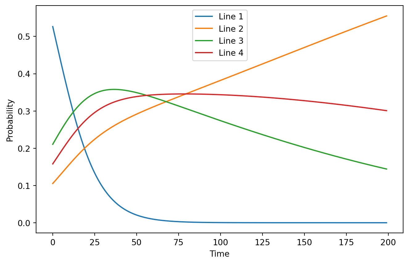
Suppose you have a variable which may take discrete values. You may observe it, with a chance of confirming the variable does not take a certain value specified by a vector . Once only one option for the variable remains, the sampling process stops.[^1] You have some prior expectation of what value the variable has, a vector . What do you expect the graph of the probability of the variable having each value to be?
It is obvious that the variable with the highest prior probability will have the highest probability in the beginning. My intuitive understanding of the problem tells me that the line with the lowest probability of being observed and disproven will rise to the top the fastest and stay there. Is this understanding correct?
Below is a simulation of one instance of this problem in Numpy.
=
= /
=
=
= *
= /

...This is a pretty weird shape! It seems like there is a single peak on this plot for each of the possible values of the variable. This is a counterexample to my intuition, even though there exist cases where it generates correct predictions.
The explanation for this is very simple. Let's model the updating process in the space of log probabilities. Doing a step of updating consists of adding the logarithm of the probability of disproving each observation and applying log softmax to renormalize the log probabilities of each value so they add up to one when exponentiated.
Log softmax works by subtracting the logarithm of sums of exponents from each value in the distribution. Let's denote it as and prove that - in other words, that addition distributes over logsumexp. , where . Now we need to prove that . We can do this by direct computation: . , for good measure.
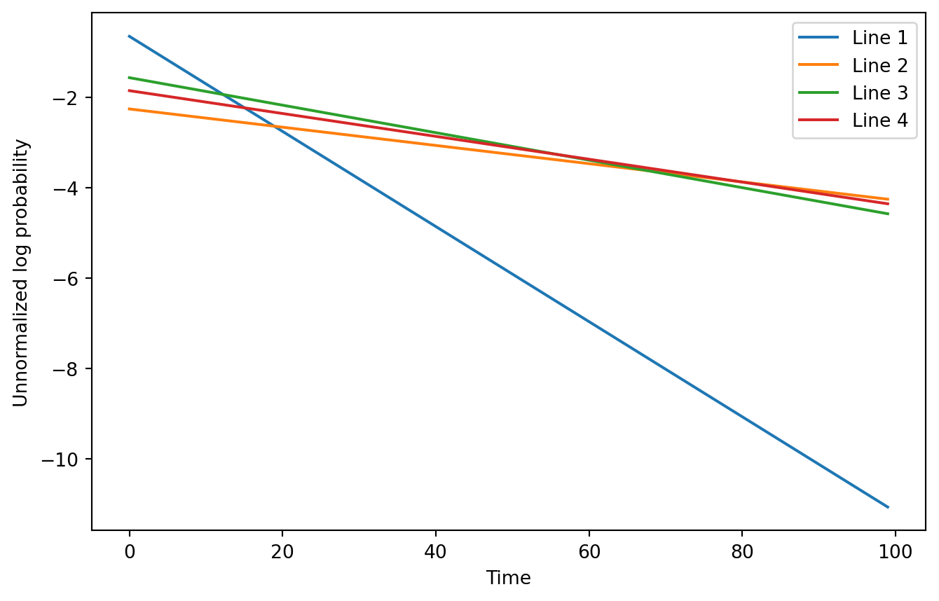
So, after steps of updating our log probability is . If we ignore the , the expression is linear in . Moreover, we know that each . This means that we have a set of downward sloping lines in unnormalized log space. It seems obvious when framing it this way that some of them may become the
= + *

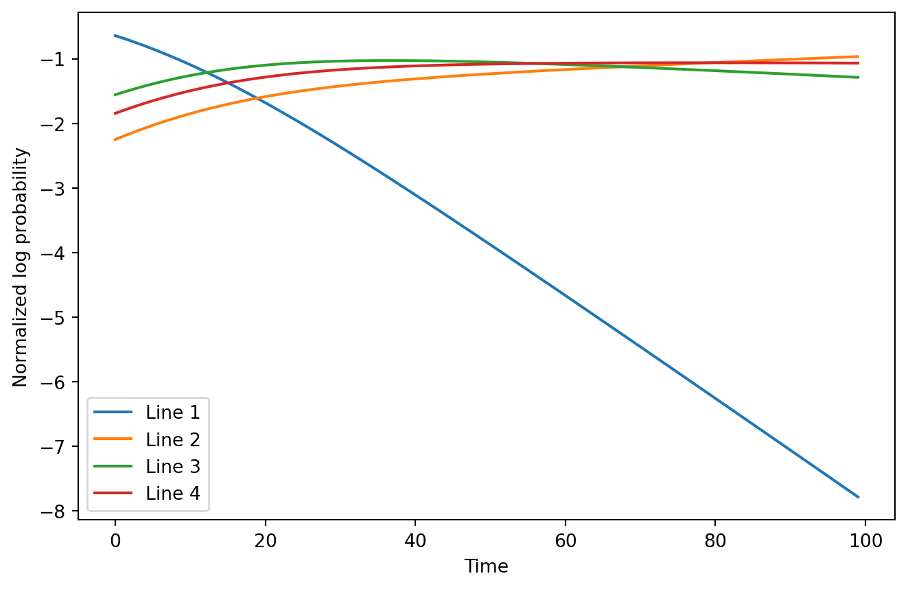
..It is kind of hard to see the top log probability switch in this example, even when zoomed in to half the observations. However, it conveys the basic idea: we can more easily predict when lines will take over each other on a log scale plot without normalization. With normalization it would look much less obvious:
= + *
= -

The fact that the lines determine the points where each possibility becomes dominant with a simple formula reminds me of a Legendre transformation. Perhaps Hough transforms could be adapted for finding the likelihoods exactly given noisy data. I may extend this blog post if I get to that.